
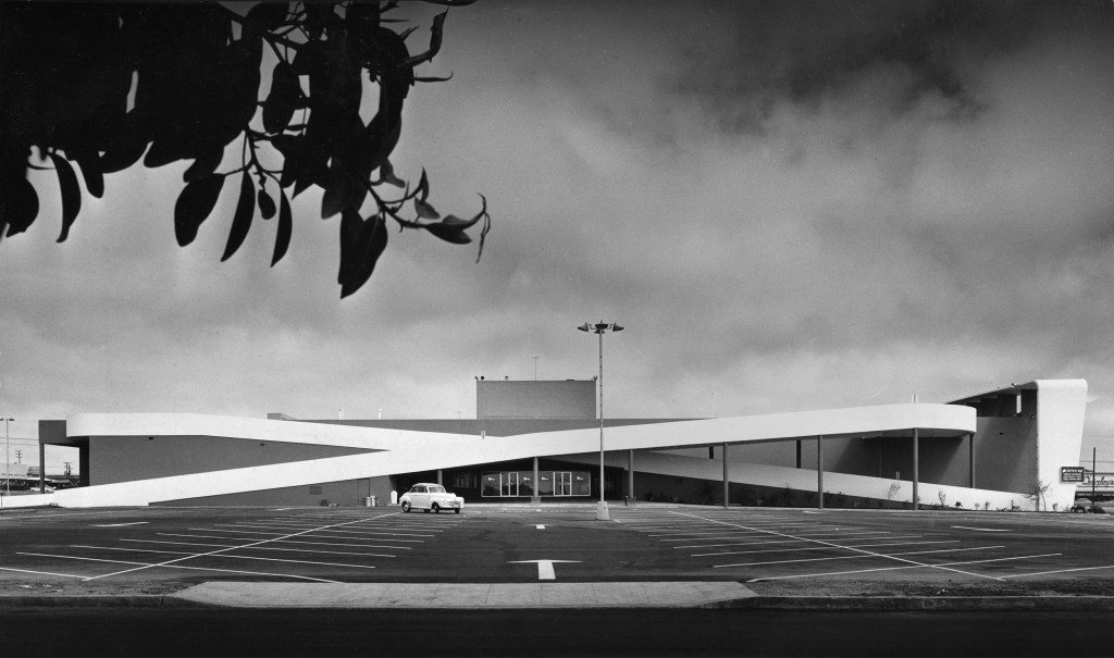
Before he became the architect of the North American shopping mall, Victor Gruen designed the Westchester, Los Angeles branch of Milliron’s department store. Typologically, this store was neither fish nor fowl. While it’s emblematic of the centrifugal movement of retail into the suburbs (the flagship Milliron’s was located in downtown LA) and responds to the dominance of the automobile, this department store still imagined a mini-urban condition with retail clustered around the sidewalks at the corner of Sepulveda and La Tijera Boulevards. Within five years it would be superseded by the shopping mall model elsewhere in the city, the same type of which Gruen would become master in short time. The building is extant, but heavily modified. Today it houses a Kohl’s: a big box store, another suburban retail type.
Text excerpted in italics and images reproduced below from Arts & Architecture (June 1949). Photos by Julius Shulman reproduced from the same issue, unless otherwise noted.
Problem: The design of a suburban department store of the low and medium price class in a rapidly growing community located on a boulevard with heavy automobile but very light pedestrian traffic; public transportation facilities are poor; most customers must come by car.
Client originally desired three story building but accepted, upon architect’s recommendation, one story layout for the following reasons: (1.) Constructions costs were lower mostly because of savings in vertical transportation and because of simpler construction materials, (2.) Operation of store is considerably cheaper because of easy supervision and low service cost, (3.) Economy in space was achieved because of reduced loss for traffic areas, (4.) Conditions for merchandising layout are more favorable because of better possibility for correlation of departments.

Unknown photographer, reproduced from Guren Associates website.
Unknown photographer, reproduced from Guren Associates website.
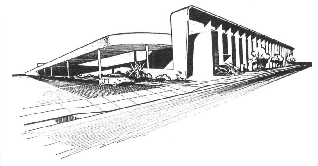
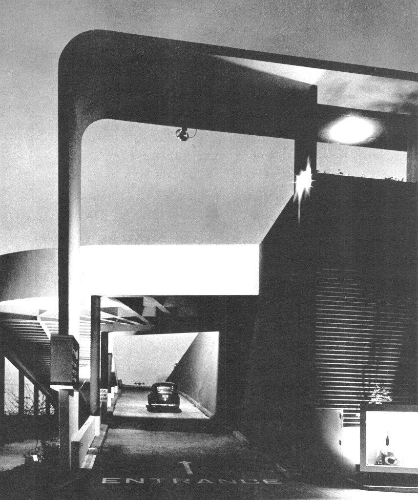
The one story layout made it possible to use the roof area for parking, thus the greatest utilization of space for parking purposes was achieved. Roof parking is made accessible by up and down ramps, each 20’ wide. Entrance to store is in center of roof, thus cutting walking distance from parked cars to a minimum. Additional parking area is located behind store and on north side of store.
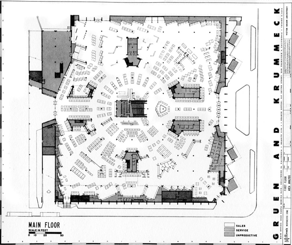
Plan reproduced from Guren Associates website.

Unknown photographer, reproduced from Guren Associates website.

Advertisement for Pioneer Flintkote roof products from the same Arts & Architecture issue as the original project article.
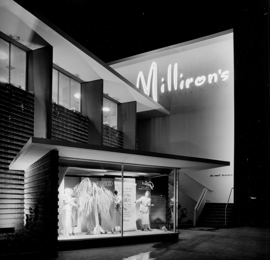
The building is moved back 25’ from the building line along the main boulevard and 10’ along the secondary boulevard. The resulting area is landscaped [Certainly, this would have seemed unique in in the 1950s, but today it appears a painfully useless suburban gesture]. Along the main boulevard four-standing display buildings are erected at an angle for easier view from passing cars. Conventional shop windows are omitted.

Unknown photographer, reproduced from Guren Associates website.
Unknown photographer, reproduced from Guren Associates website.

Visitors outside listen to speakers at the occasion of the grand opening of the store on March 17, 1949. Photo reproduced from the Los Angeles Public Library Photo Collection.
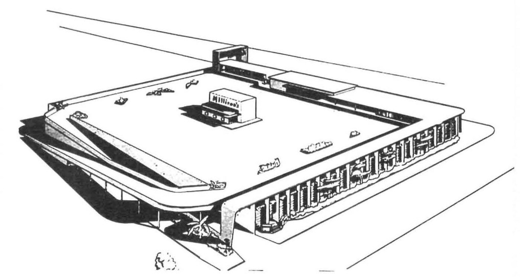
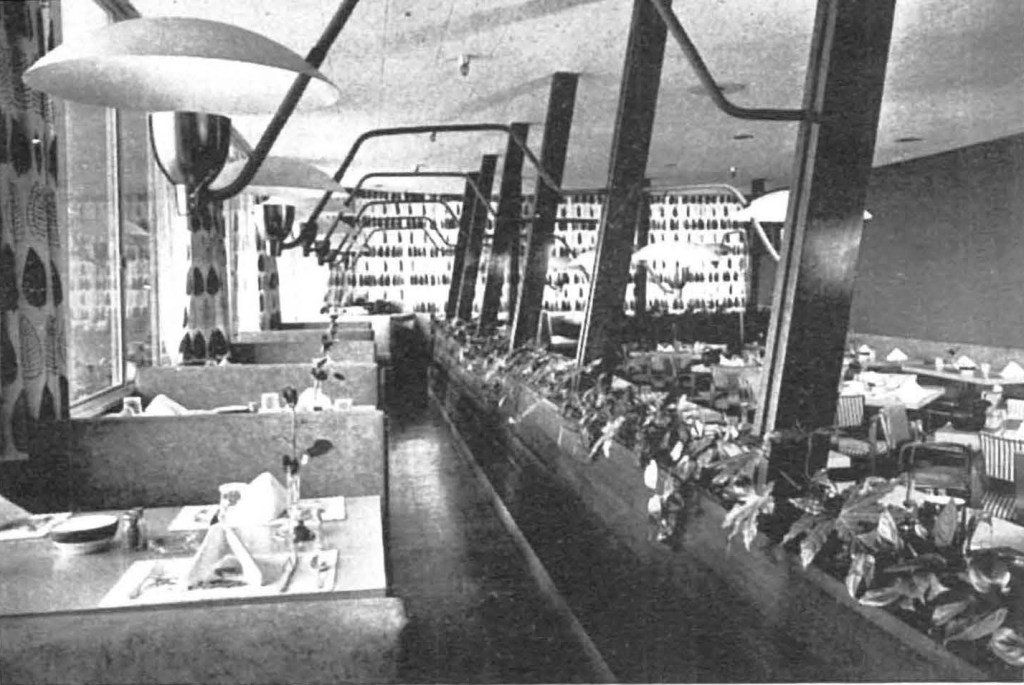
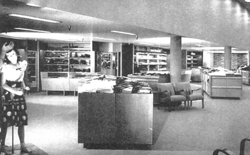
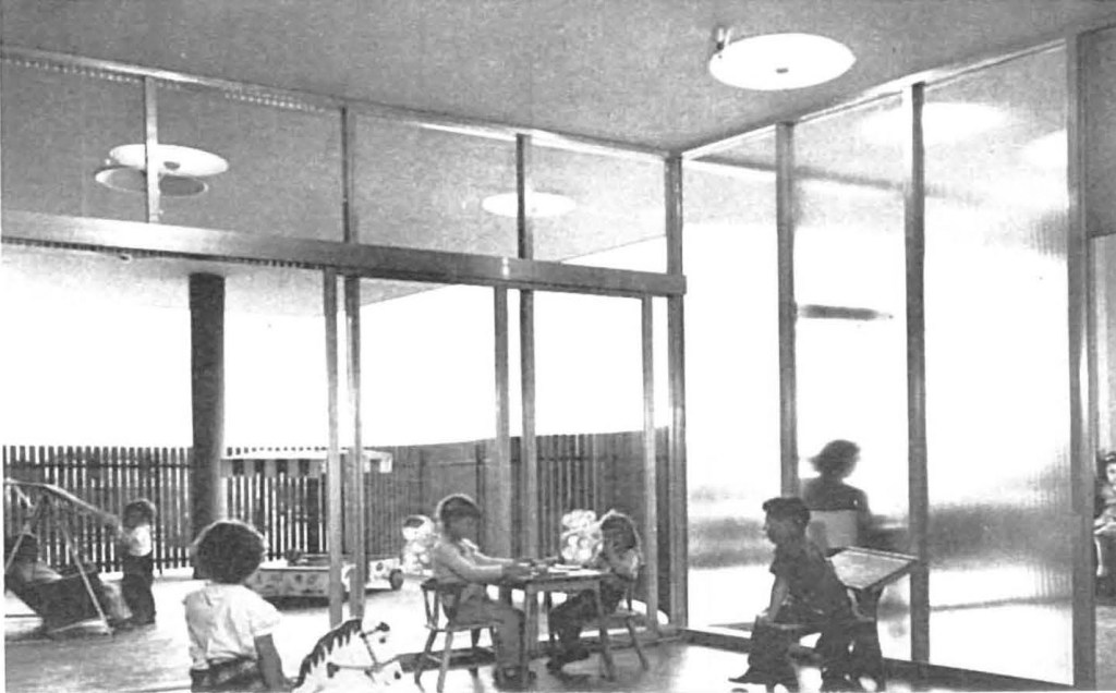
Departments which gain advantages from independent operation outside of normal business hours, like the restaurant and the beauty parlor, are located on the roof, reachable from the roof parking area and connected by interior stairway with the store. An auditorium is accessible from the roof area and can thus be made available at any hour for community activities. Special shops, reachable from the inside and the outside, are “the snackbar,” the “shoe repair shop,” all located near the rear entrance.
The building is of class “A” reinforced concrete construction and sprinklered throughout. Mushroom type columns 24’ on center with spiral reinforcing carry the 6” roof slab. The fins along the fronts are of reinforced concrete. Walls between the fins are reinforced common brick. The ramps are of reinforced concrete construction. The building is mechanically ventilated.


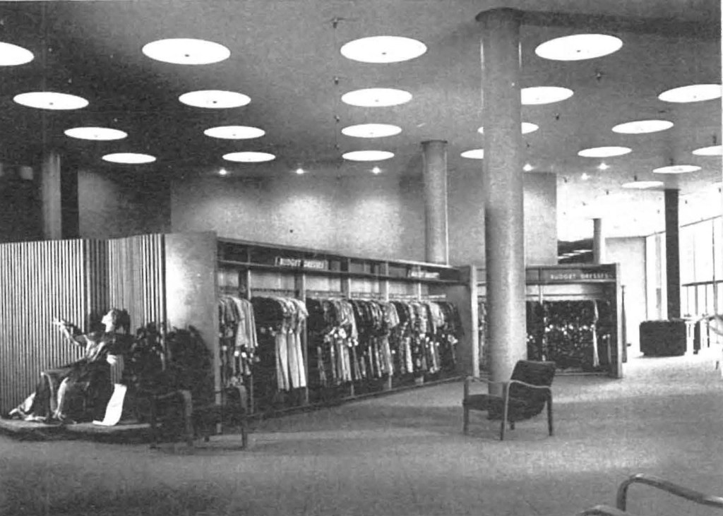
A partial basement is used for storage. Mezzanines are used for employee facilities and storage. The entire first floor is used for sales purposes. A circular center area together with two broad aisles connecting front and rear entrances contains the merchandising groups usually found on the first floor of department stores. Pylons consisting of first floor and mezzanine divide and organize the first floor into four distinct, separate areas. These pylons contain merchandising services like fitting rooms, forward sock rooms, and offices, as well as mechanical equipment. A circular concourse around the center area connects all departments with each other. The arrangement thus achieved puts five merchandising floors on one level.
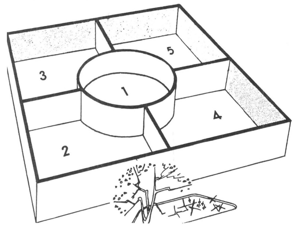
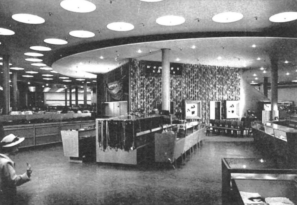
The colors play an important role in the building [too bad all the photos are black and white]. In the interior they are used for orientation. The four merchandising sectors are named, in accordance with their basic color theme, The Yellow, Rose, Blue and Green stores. The circular center portion has gray as a basic color theme. Exterior colors are dark green for fins, natural red for brick walls, white for roof overhangs, yellow and cocoa brown for solid wall partitions.

The building in its extant condition, December 2022, from Google Street View.
Milliron’s Department Store / Gruen and Krummeck Architects with Karl Van Leuven Jr. as Associate in Charge of Project / Westchester, Los Angeles, California, USA / 1949 / Structural Engineerg: Kourken Bardizbanian / Mechanical Engineering: John J. Cullinane and Hilberg, Byler & Hengstler / Electrical Engineering: H. L. Dietz and Foster K. Sampson / Architectural Supervision: Max Reder Horwitz, AIA / Extant address: 8739 S Sepulveda Blvd
